In the world of agile project management, visibility is the cornerstone of success. OneIPM has always been at the forefront of integrating seamless project management solutions within Onshape. Today, we are thrilled to unveil our latest innovation – the new OneIPM Project Dashboard. Project and resource visibility taken to the next level!
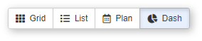
On the Project Dashboard (accessed by clicking on the Dash button at the top) you will find three distinct sections: Project Highlights, Task Highlights, and Resource Highlights. Each of these sections can be collapsed/expanded by clicking on the header text.
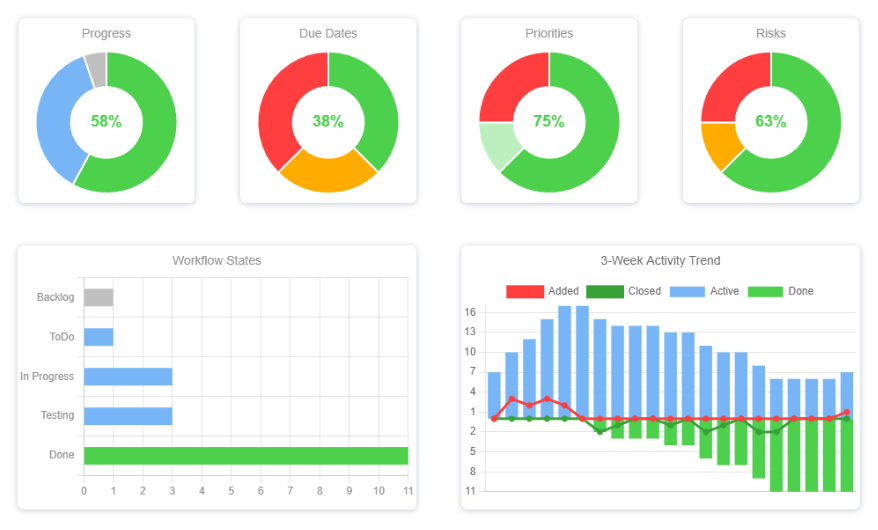
All charts (except the 3-Week Activity Trend chart) are affected by the visibility of the backlog state(s). If the Backlog checkbox at the top is checked, then chart results will include tasks that are in one of the backlog states (including any linked project states). If Backlog is unchecked, then those tasks will not be included in the results.
Project Highlights
This section provides an overview of the key project stats. Clicking on Due By or Days Remaining will open the Project Edit dialog allowing you to modify the Due By date (if you are an admin for this project). Clicking on Tasks Remaining will slide-up a task drawer at the bottom of the user interface. This task drawer will display the tasks that still need to be completed for this project to be considered done. Note, the task drawer can be closed by either clicking Tasks Remaining a second time or clicking one of the down arrows located on the left and right of the task drawer. Finally, clicking on Resources will open a dialog showing all people belonging to this project, along with the teams (if any) that they belong to.
Task Highlights
Here you will see visuals showing a high-level overview of all tasks in this project. Hover the mouse pointer over different areas of any chart to see more information. Green is always good. Orange and red are areas of possible concern. Yellow indicates missing data (i.e. no Due Dates set on a task). Blue indicates a task currently in one of the Active workflow states. And Grey represents tasks in one of the Backlog states.
The 3-Week Activity Trend chart displays four data points in a single chart. It is important to understand not only the visuals, but also how they are derived. Whenever a task is moved from any Backlog state to an Active state, that task is marked as Added on that date. When a task is moved from any state to the Done state, it is marked as Closed on that date. The Active and Done bars display the cumulative state of all tasks on any given date for the past 21 days.
You may notice that on some dates there are more tasks added than are currently active on that date. This can happen when many tasks are also closed on the same day. For example, let’s say at the end of the day Monday there are 3 active tasks. On Tuesday we add 4 additional tasks. If that is all we do, then for Tuesday the chart will show 4 added and 7 active. However, if we also close 5 tasks on Tuesday, the chart will now show 4 added and only 2 active.
This chart is not only great for understanding how quickly you are closing tasks, but also provides visibility into any potential feature creep as indicated by the Added line.
Resource Highlights
This section provides visibility into how the team is handling the workload. The lower section displays a grid showing the status of tasks currently assigned to each team member. Clicking on any box will slide-up the task drawer at the bottom. The task drawer displays all tasks that meet the criteria of the box you clicked on. Clicking on a different box will change the task drawer contents to that of the newly clicked-on box. A second click on the currently selected box will close the task drawer. Additionally, clicking one of the down arrows located on the left and right of the task drawer will close it. When viewing the task list, you can double-click on any task to edit it, or right-click on it for other options.
The new OneIPM Project Dashboard is more than an update; it’s a transformation in how you interact with your projects. It’s designed to give you a richer, more accessible, and more interactive experience, all within your Onshape environment.
Additionally, we have included numerous other user experience enhancements based on your feedback. Keep an eye out for a future update with additional dashboards to expand the visualizations of your agile project management environment even further.
Make sure to watch the brief video below demonstrating some of the highlights from this latest release of OneIPM.